Customization

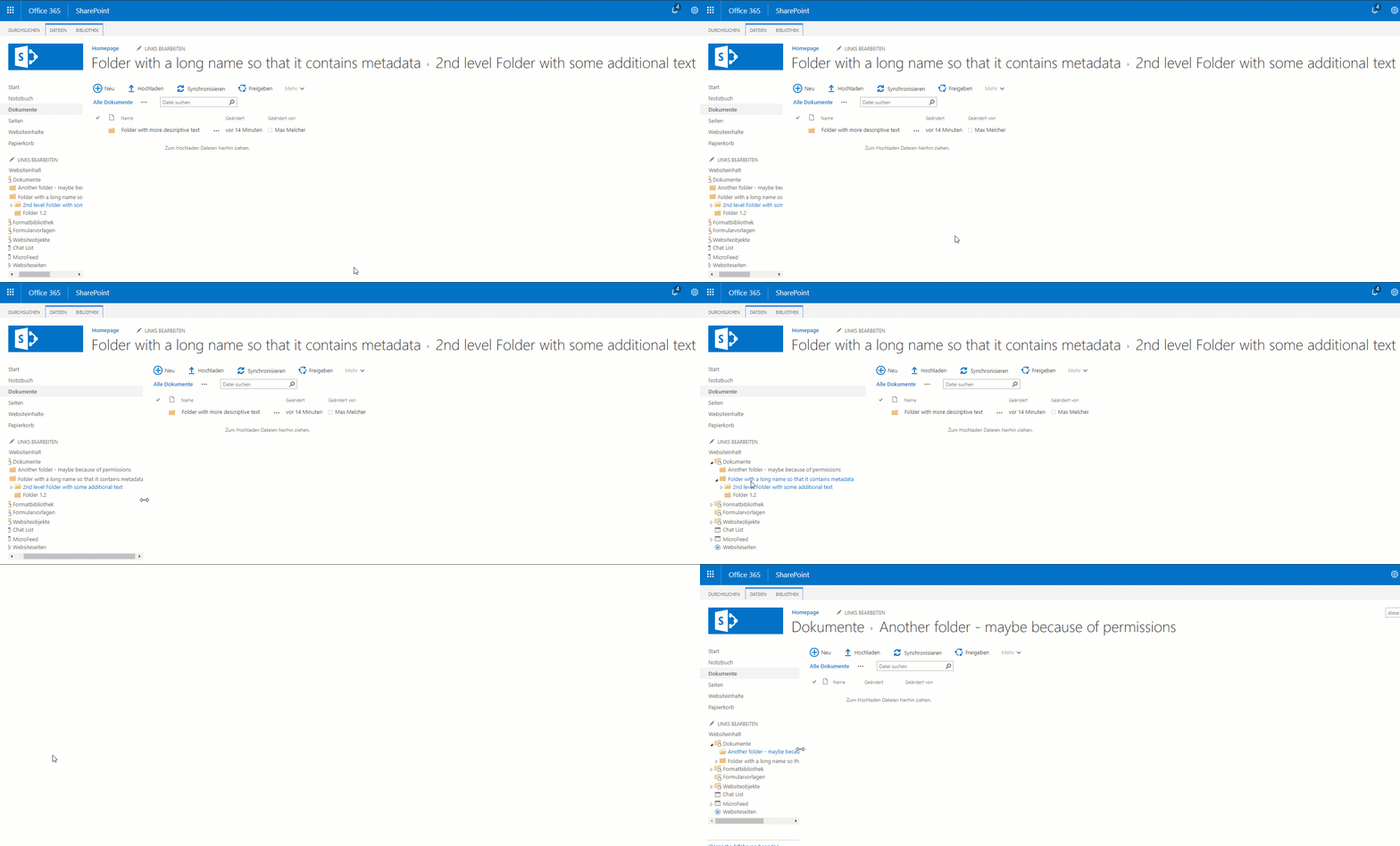
As you can see in the gif above, I created a very simple customization for a specific usecase: My users created deep folder hierarchies (of course I told them not to!) with very descriptive names (metadata!) - and if they navigate deep deep inside, they have to use the tiny scrollbar on the left. And once they navigate, the scroll position is gone. Bummer! Even the enabled tree view did not help. Let’s improve that!
In my current project I had the challenge to improve the user experience for some pages without messing too much with the MasterPage (because you shouldn’t, right?). The client explicitly requested components like accordions, responsive tables and more control of the page alignments. So what would be easier to use a mobile first, responsive made by the @twitter guys? Apparently SharePoint Online does not like bootstrap too much - one you add the css files, you will see notable changes.
I think its my first time that I attended a search session for business users/decision makers - interesting times here at SharePoint Saturday in Belgium. Here follows a summary for “Improve SharePoint Search Experience” in my words.
Speaker was Elio Struyf (@eliostruyf) - he has some nice blog posts about search, go read them!
Elio on stage Improve for everybody, don’t forget the novice users There are different types of users in every enterprise, some of them are more mature with SharePoint, some do a search query with just one keyword - well, one of Elio’s key messages was that you should optimize the experience not only for the “educated” users.


